Bringing a little more life to our images
Exploring light, atmosphere and the small details that connect design and code in our site's image system.
The same sections also compose articles. This opening adds metadata above the display title; the text section groups paragraphs, and image descriptions remain below their own frames.
Four publication treatments under review. The author option uses an initials avatar until a portrait is selected. The calendar is an experiment, not a new default.
Metadata, headline and introduction follow the existing type and spacing roles. The content changes; the reusable structure stays the same.
An introduction and the paragraph that leads into an image belong to one section when they form the same thought.
Further headings, lists and supporting details can continue in that section instead of giving every paragraph its own outer padding.
{ layout: "pair", media: [firstImage, secondImage] }Exploring light, atmosphere and the small details that connect design and code in our site's image system.
The frameworks kept multiplying. We came back to intention, collaboration and execution to move the work forward.
Coming soon
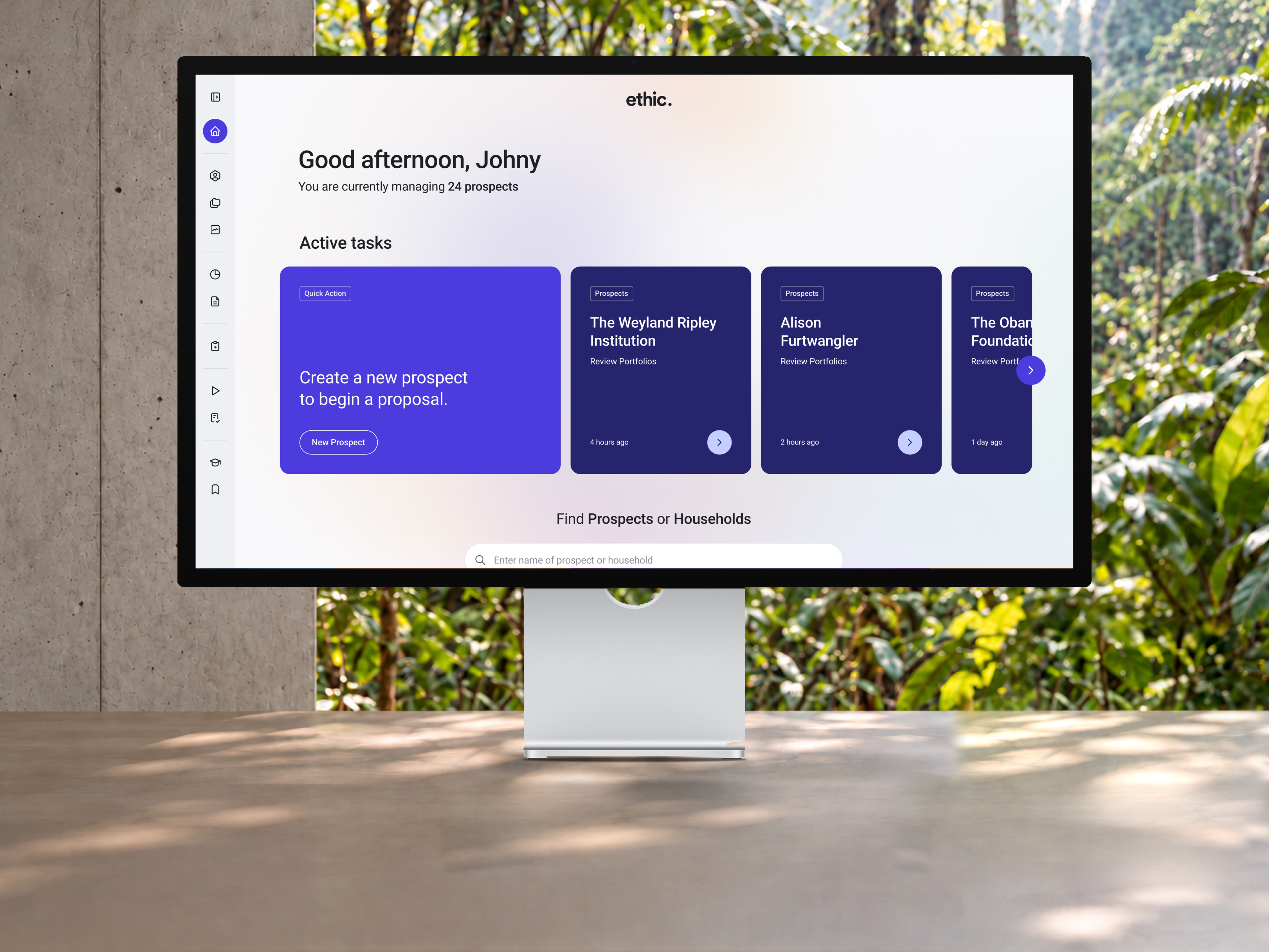
Ethic needed to feel alive, like nature. Utility, core and custom gave it a shared foundation with room to grow.
Coming soon
Pearson is the world's learning company, with expertise in educational courseware and assessment as well as a range of teaching and learning services — all powered by technology.
In order to stay competitive, they wanted to design an adaptive learning experience to empower teachers and students in emerging markets.
They had a vision for a personalized adaptive learning platform for schools to empower teachers and students in established and emerging markets.
The project was a year-long partnership where we worked with all teams side-by-side as an in-house design team to drive intention, collaboration and execution as one.
We joined stakeholders, teachers, and developers as an integrated design team to design a cross-platform experience for mobile, tablet, and desktop.
IDEO had recently delivered extensive consumer insights that needed an experienced design team to translate and distill to connect the short-term to the north star.
We infused a design approach which focused on core user needs, adaptive learning content, and different teaching styles while thinking about business needs.
The result was a connected digital ecosystem spanning league and club experiences, bringing content, video, live match coverage, and statistics together in a more unified way.
A responsive ecosystem connecting league, club, and fan experiences across devices.
Live scores, statistics, schedules, and match experiences designed around fandom.
A flexible publishing system built to support storytelling, video, news, and league content at scale.
A closer look at the design decisions and visual systems that shaped the experience, showing how shared foundations and consistent patterns come together across the product.
A scalable visual language built for consistency across every surface. Components designed to grow with the product.
Purposeful animation that guides attention without distraction. Transitions that feel native to the platform.
A type system built for clarity at every scale. Hierarchy that communicates before you read a word.
A carefully considered layout that uses proportion and space to draw attention to the work shown here.
Each section is designed to breathe, with content that guides the reader through the story at a natural pace.
A full-width image that commands the composition, using scale and proportion to establish a strong visual anchor for the section.
The caption sits in the lower half of the grid, leaving room for the image to breathe above it.
I find myself thinking of the word 'Pure', as the team iterate on your designs. I think it's a great name for your agency and way of working - it's really embedded in what you created.”
Nathan Harris
Director of User Experience & Design
Pearson
As an integrated team with great collaboration, we shaped the short and long-term visions for the platform. We also got the opportunity to apply the design principles to other connected products. The experiences have been developed and are currently being utilized by teachers and students around the world.
© 2026